Translate

31 October 2012

Day 71

The last day of the "24 Hour Sketch - Halloween" series.

Let me put it this way, bigger is not always better. This is 8.5x11. Most of you 24 Hour Sketch "fanatics" may not know that the majority of the drawings here are on 2.5x4 sheets. Truthfully, I'm not too fond of this. Though some might say, "this is good." I'll agree but I can't shake one thing. It didn't turn out like I wanted it to. A lot of it was improvised and with that I'll let you figure out how this drawing is different from the photo. I wasn't trying to make it photo realistic so I don't really care that it's different. It's the way it's different that bugs me.

Anyhow, taking a photo of this was tricky. Graphite tends to reflect a lot of light, and this awesome yellow light in the room doesn't provide for a soft flood. I ended up taking the picture with no light, save for what sun was coming in through the window and over exposed it through filters. This provided for the softer look of the drawing and basically killed the detail.

Well, here they are, The Misfits. Have a safe and horrifying Halloween!

30 October 2012

Day 70

Day 13 of the "24 Hour Sketch - Halloween" series. And what was supposed to be the last day of the Halloween series ending with the unlucky #13 is not. Seems I have the unfortunate inability to count days on a calendar.

So here he is, the masked killer from the Halloween series, "Michael Myers".

Check back tomorrow, I've got a special treat for some of you die-hards out there. I just hope I do the subject matter some justice. It's a band dear to my heart, and in my opinion the quintessential icons of horror.

28 October 2012

27 October 2012

Day 67

Day 10 of the "24 Hour Sketch - Halloween" series. "Heeeere's Johnny!"

26 October 2012

25 October 2012

Day 65

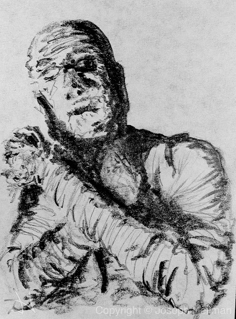
Day 8 of the "24 Hour Sketch - Halloween" series.

I really should have taken a series of photos to show this work "in-progress". Working with color, for me, is so different and strange. One thing I kept in mind was to make layers. I had recently talked with an extraordinary painter about how she worked with colors, "layer" she said. So layer I did.

I used 4 different pencils in this drawing, graphite, cadmium and crimson, and yellow.

The first layer was like any of my drawings in that I formed the subject. After which I lightly colored her in. The second layer again was like my graphite drawings in that I started the shading. This might have been premature but I did that shading light enough that it worked out. However that's not to say the shading should be done last. In this case, and the type of medium I used, I found it helpful to a layer of color on top of the shade.

When I realized that I should stop with the black, I started shading with the color. That seemed to work. For the darker shades I used crimson and cadmium for the lighter.

As far as the fire goes I just kind of swirled my pencil around and darkened in areas. I used yellow, cadmium and graphite. And one other medium not yet mentioned here or anywhere on the 24 Hour Sketch, the eraser. I've heard countless artists mention their dislike of erasers and how they refuse to use them. Their mindset is that of, "the drawing should be nothing but addition or application to the drawing platform." I disagree and believe whole-hearted that if subtraction from the palette was bad practice and should never be done then artist erasers wouldn't be made. There are quite a few different types of erasers. If used properly, the eraser can be an excellent tool. It provided for a seamless edge between the white and colored parts of the fire. I believe the drawing looks better because of that. It really brings out the intensity of the fire. It's not perfect but sometimes that isn't the point. Realism isn't always the point. And furthermore detail isn't always the point.

Additionally, many layers were added to the overall drawing to bring it together. Too many really to express how I did it in a step by step process. I was wielding two pencils near the end, flipping them through my fingers and switching back and forth line after line. There may even be a few teeth marks on them now. It was intense.

24 October 2012

Day 64

Day 7 of the "24 Hour Sketch - Halloween" series.

There is some unfinished business here, in the drawing as well. Today, I'm alright with that.

23 October 2012

Day 63

Day 6 of the "24 Hour Sketch - Halloween" series. PSYCHO!!!

It's one thing to look at a photo of someone screaming for their life but to sit down and attempt to capture that in a drawing is in a whole different playing field. It's f-ing creepy. Albeit this is an actress and she ended up being just fine. But right here and right now I'm giving props to Janet Leigh. She tapped into something. Her eyes have absolute terror in them and the drawing is really missing that. I just could not capture it. Maybe partially but not wholly.

I'm also gonna add here that my least favorite thing about this Halloween series is that most, if not all, of the drawings I'm doing are from recognizable photos. And I've butchered every single face yet. It's absolutely terrifying!

22 October 2012

Day 62

Day 5 of the "24 Hour Sketch - Halloween" series. From their house to yours.

Initially, I was going to only draw the faces. Once that was done I didn't like it. As you can see the face sizes are out of proportion and some are done better than others. In an attempt to tie it all together I drew in the rest, or rather scribbled in the rest. It turned out okay.

21 October 2012

Day 61

Day 4 of the "24 Hour Sketch - Halloween" series. This wouldn't be complete without "The Crow". So I'm paying a little tribute to Brandon Lee here.

I wanted to do this quickly. My guess, and I'm no art history major, is this would fall under the umbrella of post-impressionistic. I say this due to the concentration of form and lines. The jacket is simplified to represent just what it is. And in fact was the first thing I sketched out. The face is a concentration on light/shadow and form. Using the edge of the pencil I quickly worked in the shadows and made things darker as I saw fit. This is not saying I didn't use any line. Obviously you can look at the drawing and see line was used. I tried to use a technique my mother told me just yesterday to geometrically shape the face and then with those constraints work in the curves. My understanding of this is through triangulation (a drafting term).

I chose to make this simplified due to the fact that I didn't want to flush out a drawing of a celebrity that didn't look like the person and Brandon Lee in the role of Eric Draven is "realistically" drawn way too much.

20 October 2012

Day 60

Day 3 of the "24 Hour Sketch - Halloween" series. The original ripoff, Count Orlok.

19 October 2012

Day 59

Day 2 of the "24 Hour Sketch - Halloween" series. Who is Ol' Frankie without his bride?

So, here's the deal, the perspective is skewed. I had to work with this for a few minutes to make her look a little less "off". Otherwise I'm happy with it. Keep checking in, it's only gonna get spookier folks! Man I wish I could insert a Vincent Price laugh sound clip right here!

18 October 2012

Day 58

Day 1 of the "24 Hour Sketch - Halloween" series. Who better to kick this off right then the king of monsters himself?

17 October 2012

Day 57

It's a friggin' banana! How hard could it possibly be? This is what I told myself before drawing this. I was so wrong.

16 October 2012

Day 56

I've done it before and I'm doing it again! Only this time I'm letting the whole world see it. That is, it is available for the whole world to see it. Anyway, it's a huge pet peeve of mine, and when I say pet peeve I really mean I loathe it when an artist draws someone famous and the drawing fails to look like the subject. But here I have done it. I'll say for saving grace that I wasn't feeling in the mood to draw and every time I got a moment to make a line I was interrupted. I can't say it's not expected; I was at work. Anyway, the first person to guess who this famous person is wins! I'll send you the original or redraw it and send that, your choice.

14 October 2012

Day 54

Bringing back the red. This was done on black paper with white charcoal. I brought in the smudge sticks to blend the tones together which is what I should have done on yesterday's sketch. I need to practice but I'm a little intimidated when I sit down with this type of drawing. With time that will change, so keep coming back; it's only gonna get worse folks!

13 October 2012

Day 53

So the photo is from somebody who does smoke art. Google it, it's pretty cool stuff. When I sat down to draw this I knew I wanted to do it on black paper. I've never been able to make anything look good on black paper. So needless to say I knew this was going to be a learning experience and I didn't have much for expectations. Secondly, I knew I needed to use a variety of gray tones. I own but have never used my gray pastels. Hell, I've never even used pastels. Again, this was going to be a learning experience. Thirdly, because of the black paper and larger pastel medium, I knew this drawing was going to have to be bigger than the previous 24 Hour Sketches. It's 9"x12". I got nearly done, and not wanting to go too far and ruin the drawing I decided to put fixative on it. That ruined it. It turned splotchy and I could actually see some of the tones disappearing. I waited for it to dry and went back over it. One cool thing about drawing over the fixative is that you can smooth out lines without effecting what is already fixed to the paper. Not good practice, I think, but it worked out in this case. I kind of like how it turned out but it's just not the same as before I sprayed it.

12 October 2012

Day 52

This one is all about the stroke, I know at least three people who are taking that out of context. And now everyone is.

The sketch is minimal, used only a pencil and I ran it through a levels filter to pull out the black and white and this is what I got. I also accidentally put a stress line through the paper. "Terrific!", I said.

11 October 2012

Day 51

With ACL this weekend I decided that it was only too appropriate to pay homage and respect to the music by drawing a 24 Hour Sketch as such. I really like how this turned out. I actually felt capable the entire way through. No doubts about where the drawing was going entered my mind. From preliminary outlining to the dark strokes I had my intention set and executed it perfectly. Even the burst of light turned out the way I wanted. It's raw and poetic, just the way I prefer my music. Forgive the confidence, I don't mean to come off sounding cocky, I really am proud of this one.

10 October 2012

Day 50

So before I drew this I was looking up realist artists. I'm talking about paintings that look like photographs, color and all. It inspired me. I know it can be done with just graphite but how to do it is beyond me. I'm stuck on technique. But for what it's worth this drawing did turn out alright. Just not as "alright" as I wanted it to be.

09 October 2012

Day 49

7 weeks doesn't sound like a long time. Even looking back at 7 weeks it doesn't seem like a long time. Looking forward 7 weeks doesn't seem too long. But when I say 49 days, that holds some weight. Even more so when I think how it's been 1176 hours, holy shit! All in all it's pretty cool that I've been keeping it up this long. Anyway, this one looks good though I do wish I had my 6B with me to darken in some spots. The feet in the photo were hidden by the shadow and I just couldn't get it dark enough. It kind of looks like he's got short legs.

08 October 2012

07 October 2012

Day 47

I'm not gonna whine about this one. It's complex and interesting (the photo). This drawing rendition doesn't look exactly like the photo; I improvised on a lot of it. If it wasn't for my 6B graphite pencil to make all those dark spots I don't think this would have turned out so well. Cheers!

06 October 2012

Day 46

My wife tells me this picture is a big Pinterest hit. What else can I do but to try and drive some blog views by tapping into an already hot commodity? And now all of you get to, through some minor sleuthing, compare a drawing of mine to it's origin. I'll also add that this is the first 24 Hour Sketch to implement graphite pencils with varying hardness: HB, 2B, 4B, and 6B. Have a good weekend.

05 October 2012

Day 45

So I had a red pencil lying around…

On another note: Apparently I can't draw a leaf. I'll just "leave" that up to you. Tell me, this means comment, do you think I can draw a leaf? The poll begins now!

04 October 2012

Day 44

Here it is. It was a busy day, which was good, but not good for sketching. I rushed into this one to try and get one in for the day and it turned out pretty good. Tell me what you think. If you have any problems with leaving a comment I apologize on behalf of google. I know they have their best peeps on the job, being that I'm such an important client and all.

03 October 2012

Day 43

I've been thinking about doing this one for about a week or so. Honestly, been kind of scared of it. I didn't have a very good copy of the photo and like the condensed breath of the wolf before this explosion of chalk had me wondering how I would draw it. Nonetheless, I am digging the fine lines and detail I was able to extract from this. I was surprisingly less meticulous about finding every detail and just worked with what I could see. If you take a look at the hands, for instance, they are done with the utmost respect to minimalism. I learned so much from this sketch that by the time I got around to the chalk bits, I didn't worry too much about it. Just worked with what I could see, what looked good, and what made sense. This drawing might be a record breaker, not that I'm keeping stats, with a draw time of about 1 hour. My only complaint is I should have spent more time darkening the background so as to make the image pop a little more. You may be wondering, "Well, why don't you just fix these "complaints" of yours before you post?" Perfection is not the point of this blog.

02 October 2012

Day 42

I don't know what I got myself into today. This one was hard and I really simplified it. Other than the fact that the woman you see through the glass looks completely different than the woman outside of the glass, I like it. The funniest part of all this is that I thought it would be great practice on refraction. I didn't even notice the reflection on the table until half way through! In addition, if you've been reading the blog at all, at least within the past couple days, I mentioned a technique to achieve a white line on white paper. Further more, this technique does not require me to be overly conscious of the line; I don't have to ride the edge of the line with my pencil. I didn't use it everywhere, but used it quite a few times. And I got to tell you, I haven't perfected it yet, but it works pretty good. It's a simple process of scoring. A great example is the fine line indicating the top of the glass vase running through the hair.

01 October 2012

Day 41

Back to focus. Today, I had to remind myself of the importance of forming before drawing. Luckily, I did this before I started. It's so much easier to detail once that is done. Eventually I hope to just start without the reminder. Don't hold your breath.

So, I think it tuned out alright. A little misshapen here and there but mostly pretty good. The wrist bugs me. It should bug you too. In fact you should be so bugged by it that you feel inclined to leave a comment like, "Dammit, fix the &:):@/@-$;@ wrist!"